Posts Tagged with “#design #planning”

Demystifying the ADDIE Process: A Beginner’s Guide

Welcome to the world of instructional design!

If you’re new to instructional design, you might have heard of the ADDIE model but aren’t quite sure what it entails. Fear not! This blog post will break down the ADDIE process into bite-sized pieces, making it easy for anyone to understand.

What is ADDIE?

ADDIE stands for Analysis, Design, Development, Implementation, and Evaluation. It’s a framework that many instructional designers and training developers use to create effective learning materials.

Why use ADDIE?

The beauty of ADDIE lies in its flexibility and systematic approach. It guides us through creating educational programs that are both effective and efficient. Plus, it’s iterative, meaning we can continually improve our materials based on feedback.

So there you have it—a quick tour of the ADDIE process. Whether you’re an aspiring instructional designer or just curious about how learning experiences are crafted, understanding ADDIE is a great place to start! I hope this blog post helps clarify the ADDIE process for you.

If you found this content useful to you, your business, school or institution, comment and share.

Learn the power to attract, to persuade, and to engage your audience using images

A picture is worth a thousand words

That phrase may be cliché, but it is one all designers should live by. Images have the power to attract, to persuade, and to engage your audience. Images can make any design more powerful and enrich your content.

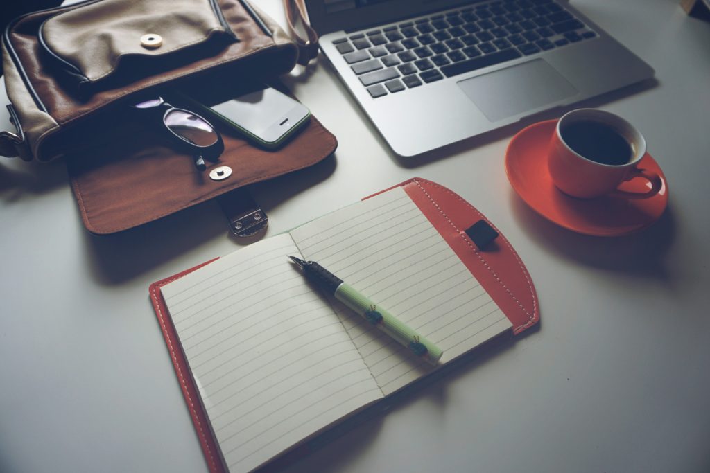
Image. Courtesy of Georgie Cobbs


Images are processed 60,000 times faster than text. People remember 10 percent of what they hear, 20 percent of what they read, and 80 percent of what they see.

The power of visual communication has rocketed with the rise of digital and social media. An image in your design can help you connect with the audience and make a strong impression even before they’ve even read a single word.

Adding images to your work can make all the difference in your design.  Keep it in mind when planning your next project.

The video is courtesy of GCFLearnFree.org.

Learn a little to make a big difference when typography matters

Typography is about much more than making the words legible.

It’s central to the skills of a designer. But typography is much more than the “design” of the typeface and characters. It also includes the arrangement of the letters and characters, the point size, line length, the spacing between characters, and lines.

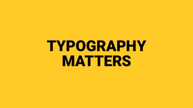
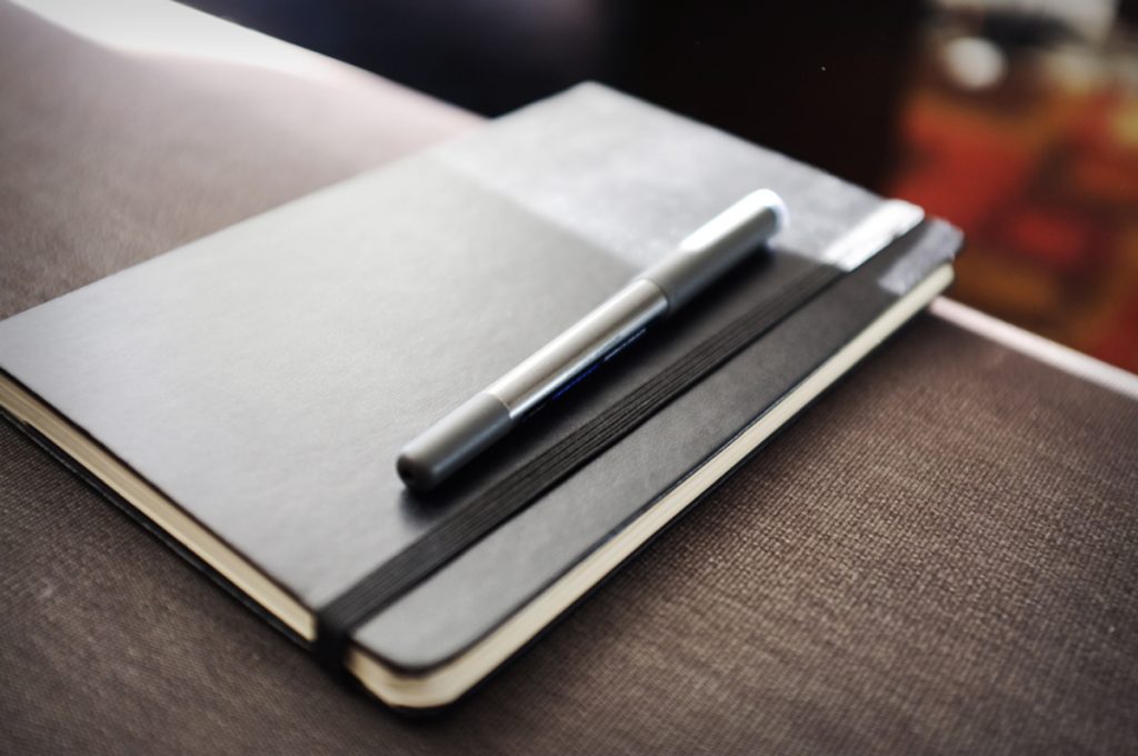
Image. Courtesy of Runyu Xia


Typography is everywhere and there are many typefaces. It can be overwhelming. The choice of typeface you choose and how it works with your layout, grid, colour scheme and so on will make the difference between a good, bad and great design.Selecting a typeface is daunting and intimidating. It doesn’t have to be. You just need to know a little to make a big difference. Knowing just a little will help you overcome typography challenges when planning your design.

When you realize how much thought that goes into carefully selecting a typeface, it will become easier to recognize the differences between typefaces, and understand why they might’ve been chosen in the first place.

The video is courtesy of GCFLearnFree.org.

Learn the five rules of design composition & layout

Composition & layout are the building blocks of graphic design.

All graphic design projects start with the composition and layout. This gives your project structure, and determines which concepts work well together to obtain your desired result.

A strong composition will attract attention and engage the viewer whether the project is a print, web, mobile, and many more designs. Without a well composed layout, your project will basically fall apart, potentially miscommunicate, disengage, and eventually confuse your reader.

The following video provides you with five rules to consider when you begin your design.  This video is a great quick refresher but it’s also great for people who just dabble into visual design. By having the foundational knowledge of composition & layout, with time, and care, you can create an incredible experience for your viewer for any design project.


The video is courtesy of GCFLearnFree.org.

Better plan your designs with amazing colour combinations

Colour plays an important role in the visual design of your project.

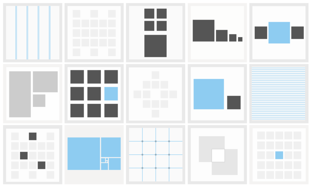
It can attract attention, organize content, emphasize elements, evoke emotion and help a design look aesthetically pleasing.


Designers work with colour on a daily basis. Colour is integral to good design when designing an mobile app, an eLearning, a print project, or a company brand.

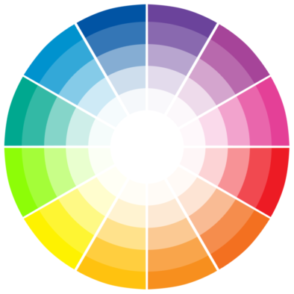
Without knowing the fundamentals of colour,  you can spend hours trying to find the colour combinations for your project. These are hours you can spend on more important tasks on a project.


I found the following video as a great refresher. If you’re new to visual design, it can help you overcome hurdles and help you better plan your designs with amazing colour combinations.

The video is courtesy of GCFLearnFree.org.